Slush
Timeline: Sept 2018 - Dec 2018 and Sept 2019 - Dec 2019
Type: Volunteer
Role: Developer, UX Designer
Tools: Vue, TypeScript, Figma
Skills: Interaction Design, Front-End Development, Prototyping
Context
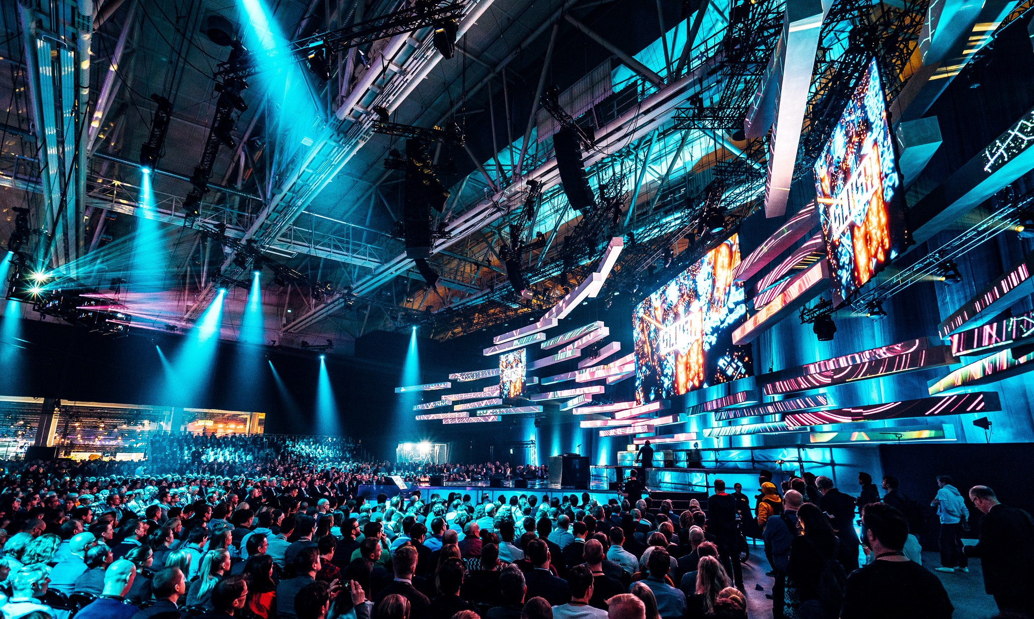
Slush is the world's leading startup event, where 20,000 tech-heads come together. Over 100,000 meeting requests were made with their Matchmaking software in three days, during Slush 2018.
My role
I was lucky enough to be a part of the product team of Slush during 2018 and 2019.
My team was tasked to improve the user experience of Slush's Matchmaking app. Techincally, I was a web developer, but in reality everything I did was more in the realms of UX engineering. From design, to programming, to prototyping and so forth.
Problem
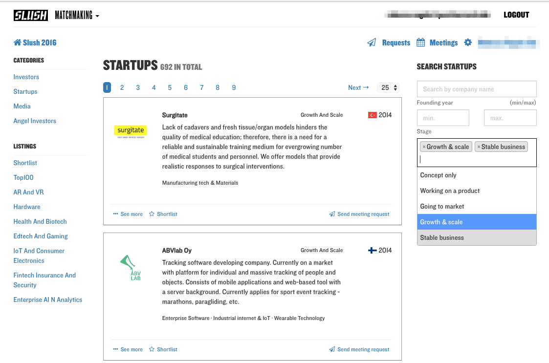
The old Slush Matchmaking app
In 2017, Slush released their Matchmaking app. 2,600 startups and 1,600 registered investors pre-booked over 10,000 meetings that were held during the event in 2017.
In 2018, Slush wanted to increase that amount by tenfold.
The task: improve the user experience, to make users want to use Matchmaking.
Solution
Clarify, simplify, engage.
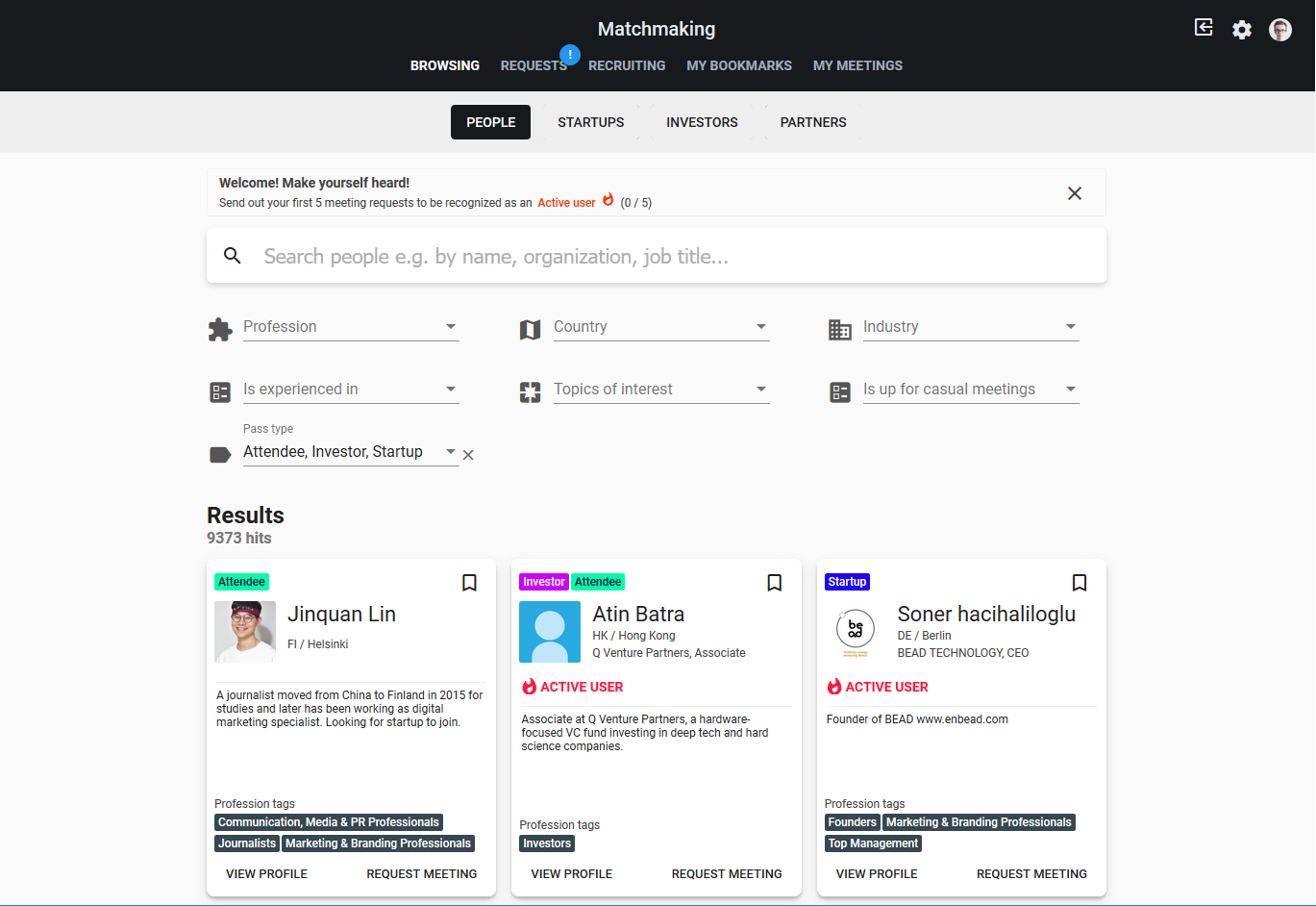
The redesigned Slush Matchmaking app for the 2018 event
Process
1. Research
Before I came into the product team, user research about the app's usability issues and other quirks had already been conducted.
The results were quite clear: people didn't like using it, because it was unclear, looked old, and didn't really offer any incentive to use it.
Incentivizing something that's not really a key part of something like an event is super improtant, if you want to get people using it.
The bottom line of the research was, that people love the idea, but the execution is a bit lackluster.
2. Brainstorming
The team and I sat down in a glass-walled conference room, and began jotting down ideas on a whiteboard.
What did the users want? We knew they liked the idea, we just needed to come up with ways to make them want to use the app.
We knew that we would have to change the visual side of the app, to reduce unneeded friction between our bleeding-edge tech-head users, and our clunky old UI.
Still, that wasn't quite enough to entice users to use the app in our opinion. But what would be? We even threw around ideas about implementing a Discord bot, until we came to a few solutions:
- Gamify the app, allowing users to earn an Active User symbol on their Matchmaking card.
- Different meeting types could be added, since a lot of our users aren't VC's or Startups, and might want to have meetings that aren't surrounded by business.
- Make requesting a meeting fast so that users don't have to dwell on the site, and try different links to find their way around.
- Consistency needs to be improved, to make navigation easier for the users.
3. Hackathon prototype
In September 2018 me and the web development team held a hackathon, where we separated into different teams and tried to come up with solutions to different kinds of problems surrounding the web services of Slush 2018.
My team decided to focus on the UX of the matchmaking app. We took what we knew already, and went to work.
Quickly, we decided to start using Google's Material Design as the basis for our layout. That would help us solve the problem with consistency, and thus make it easier and faster to use the app.
We also decided, that we should try adding a new sort of meeting type called casual meetings, that would allow users to book meetings that were - well - more casual.
We created this functional yet bare mockup of our idea during our 48h hackathon. After that, it was time for feedback.
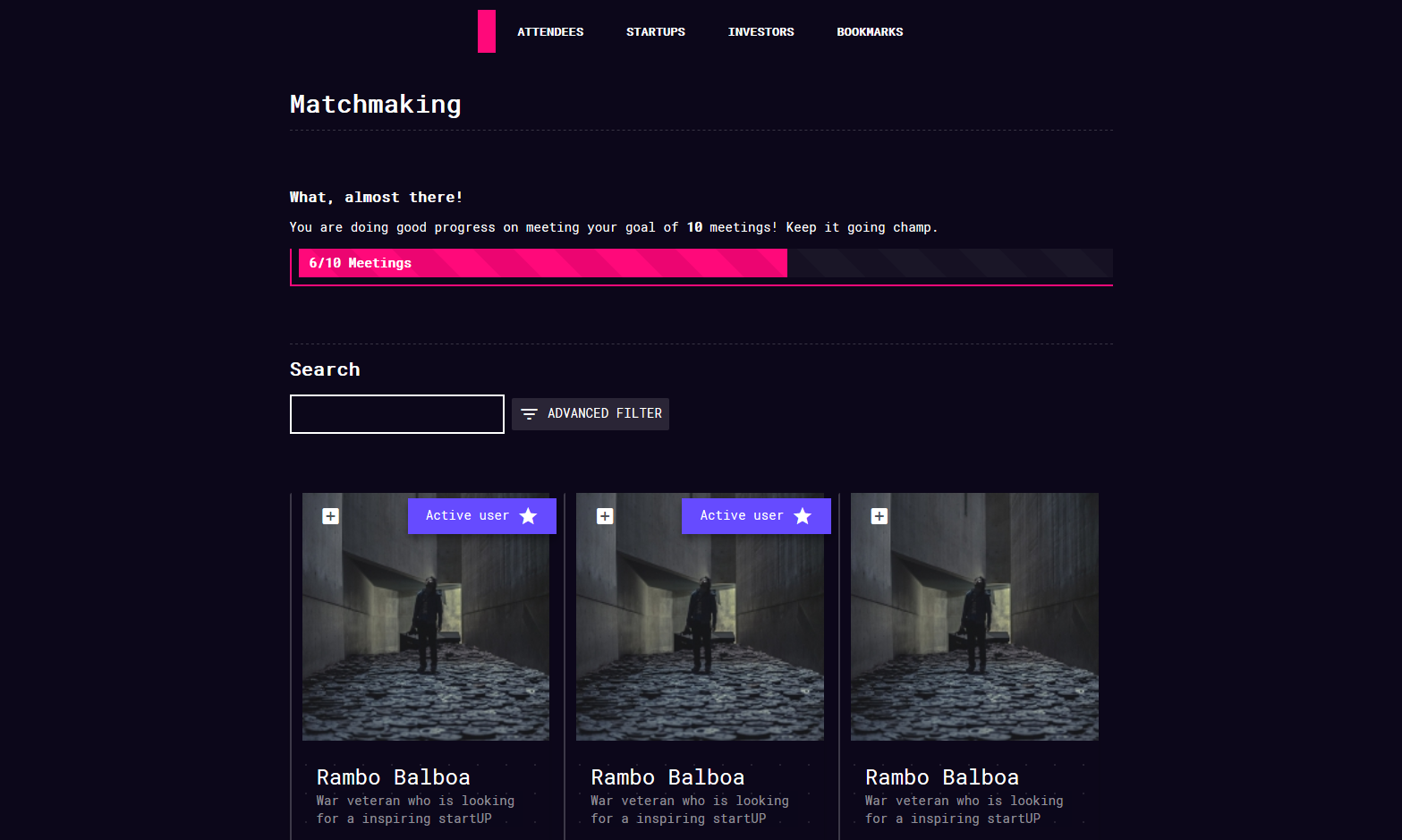
The demo we created during our 48 hour hackathon using Vue.js and TypeScript.
4. Feedback
We showed our prototype to the rest of the Slush web team to hear their feedback about it.
Overall, the feedback was very positive. They liked our idea of the new layout, as well as the idea about having casual meetings implemented into the app.
They also thought that using Material as our design language was a smart decision, but people preferred a lighter colour scheme as opposed to our darker one.
Based on the feedback and our suggestions, the Slush team started working on a renewed version while also interviewing users at every step of the way.
Most of the user interviews were actually done in-house. Since Slush is such a large organization, there are lots of people with different backgrounds, but who still fit into our customer groups.
5. Completed redesign
After a few months, the redesign of the app was complete.
The matchmaking app
During the event itself, the Matchmaking app was one of the most visited pages related to Slush. It gathered lots of visitors, who also were kind enough to lend us their feedback.
We got to hear lots of valuable thoughts, and those will be used during following years to make the app even better.
Outcome
During the event there was a constant stream of Tweets talking about Matchmaking, which really warmed my heart.
@SlushHQ for a great #Slush18! Thanks #volunteers for making the #startup / #investor matchmaking run so smooth 👍🏼 See you 2019! #NordicMade— Magnus Lundin (@magnusswede) August 12, 2018
Learnings
The Slush Matchmaking app was a learning experience for me. I got to think a lot about user-driven design, the tricky technical parts of delivering websites at a scale of hundreds of thousands of visitors, as well as working with a substantially sized team on a large project.
So what were the main takeaways?
Simple ideas can have tremendous value
I came to realize this during our brainstorming sessions. We tried to make sure that everyone was comfortable, and kept telling eachother that there were no stupid questions. Some of our "wilder" ideas, like the new meetup types were already added this year, and some others will be added next year also.
Combining many simple features into one cohesive package made the user experience that much better, and we were able to achieve our goal of getting 10 times more meeting requests.
Cohesion is key
During the previous year, Slush's visiors had trouble navigating the app, since practically everything was built in-house, but without a clear enough documentation.
Designing things in-house is great, but sometimes it's better to adopt a prebuilt design language, like we did with Material Design. It helped us tremendously, and took out unnecessary variables that different people might bring to the table.
Remember your "why?"
It's easy to forget why you're doing something: maybe you get distracted by new tech, cool design or just don't feel like working on something for long enough. No matter what, it's essential to why you're designing something, and for whom.
During this project, this was something I had to constantly think about. I wasn't working at the Slush offices all the time, so I wasn't able to keep my hands on the project the entire time. It was essential to remind myself why and who we were designing for.
We all know, that in UX design the most essential thing is the user. We need to keep them in mind, no matter what.